


Unlock Win and Beamsign
Making self service a first class citizen.
Intro
Team: Beam Benefits
Role: Product Designer
Timeframe: Three Months
Tools: User Research, Wireframes, Prototyping, Usability Testing, User Flows, UI Design, Wireframes, Prototyping, Usability Testing, Iterative Design, Style Guides
Selling and managing employee benefits is, by nature, a complex process. It involves multiple stakeholders, significant amounts of data, and decisions that have real consequences for the employees and families who depend on them. At Beam, that complexity was unavoidable. What should have been avoidable was the additional layer of friction the internal workflow was creating on top of it.
Like other employee benefits companies, Beam delivers its service through a combination of digital tools and people-driven processes. Sales teams, brokers, underwriters, and group administrators all play distinct roles at different stages of the customer journey, and the experience works best when those roles connect seamlessly. In practice, they were not connecting seamlessly at all.
Users moving through Beam's workflows were being asked to navigate across multiple disconnected products and hand off between several different teams to accomplish what should have been a continuous, coherent process. Every unnecessary handoff introduced a new opportunity for delay, confusion, and drop-off. Every context switch between products added cognitive load and eroded confidence in the experience. The cumulative effect was a service machine that was working harder than it needed to and delivering less than it should.
The costs were showing up in three places simultaneously: operationally, where the fragmented workflow was creating inefficiency and overhead for Beam's internal teams; commercially, where funnel throughput was being suppressed by friction that had nothing to do with the quality of the product itself; and experientially, where customers and brokers were absorbing complexity that belonged to Beam's internal architecture, not to them.
The opportunity this project set out to address was not a single broken feature or a neglected user need. It was a systemic one: how do you redesign a fragmented, multi-product workflow into something that feels unified, efficient, and worthy of the trust that customers place in it?
Background
The answer was not to patch the existing workflow. It was to reimagine it.
The core insight driving this project was that Beam's individual digital tools were not the problem. Quoting, implementation, enrollment, and renewal each existed as functional point solutions that served their respective purposes reasonably well in isolation. The problem was the space between them: the manual handoffs, the context switches, the operational overhead required to stitch one stage of the journey to the next. Users were not failing because any single tool was broken. They were failing because no one had designed the connective tissue that turned a collection of tools into a coherent end-to-end experience.
The vision for the Digital Self-Serve Platform was to build that connective tissue.
Rather than asking users to navigate between disconnected products and rely on Beam's internal teams to bridge the gaps, the platform would lean heavily into automation to make those connections invisible. Quoting would flow into implementation. Implementation would flow into enrollment. Enrollment would flow into renewal. The seams between stages would disappear from the user's perspective, replaced by a continuous, guided experience that moved brokers and group administrators forward without requiring manual intervention at every transition point.
Critically, self-serve was not being positioned as a secondary option for users who did not need support. It was being designed as a first-class citizen: the primary, preferred path through the Beam experience, built to handle the full complexity of the benefits workflow without defaulting to human operational lift as a crutch.
The design mandate was clear and deliberately ambitious: design for no or minimal manual operational involvement. Every workflow decision, every interface pattern, and every system integration would be evaluated against that standard. If a step in the process required a Beam team member to manually intervene in order to move a user forward, that step represented an unresolved design problem, not an acceptable operational reality.
This framing shifted the nature of the design work significantly. It was no longer sufficient to make individual screens usable. The goal was to design a system that was capable of carrying users from the beginning of their journey to the end with confidence, clarity, and as little friction as possible, regardless of the complexity of what was happening beneath the surface.
Design
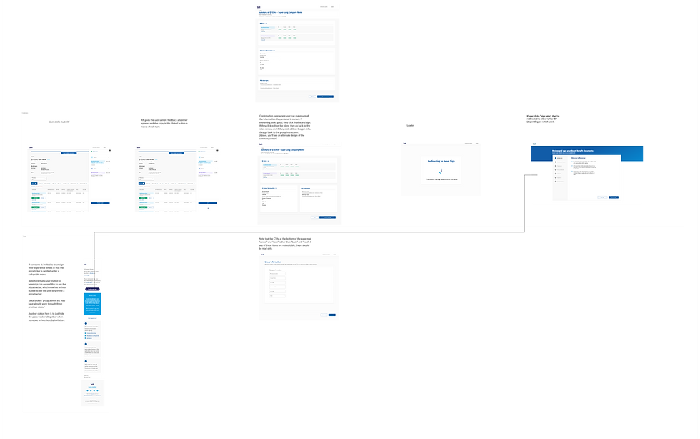
I started the design process with several stages of fat marker sketches at a very high level. The focus of these early fat marker sketches was to set expectations for the user: What is Beamsign and why are you using it? To that end, having an explanation of the signing tool “Beamsign” was paramount, so I mocked up a carousel that takes users through what beamsign is and how to use it.


Once we moved onto the lofi screens, we discussed with engineering what would be feasible. For these experiences, I designed 2 iterations: one that sees the welcome screen as a multi step process, and one that sees it as a single modal.

As I designed a multi step carousel, it became evident that all that was necessary was a single modal with all the information, and instead of a modal, it could just be a step in the signing process.
Usability Testing
Tests for Beamsign and win were largely positive. Something we discovered, however, is that users don't tend to immediately win a quote. They build it, share with their group, possibly make changes, then win. This critical step in the process led me to add the “save and return to broker dashboard” button on the summary screen. This allows the user to save their quote and return to win it when they’re ready.
The Positive
•The platform is fairly simple and easy to use.
• The quoting process is streamlined and doesn't require a lot of information.
• The ability to view a PDF on the summary screen is helpful.
What I Can Do Better
• The Finalize and Sign button may be below the fold on smaller screens.
• The process for enrollment is lengthy and can take time for employers to select plans.
• The platform could be more inclusive by offering subtitles and better language support
•The process for leaving and returning to a quote could be improved.
Usability Take Aways
A major take away from the usability testing is the need to Save Progress. Users said repeatedly that they don't tend to win a group immediately after putting together a quote, but rather they share it with their group. Therefore It would be nice to have a save quote feature to return to later.
Prototype
Here is a recording of part of the prototype in action.
Learnings
Usability testing for Beam Sign and Win was largely positive, and the feedback validated many of the core design decisions made throughout the project. But the most valuable thing testing gave us was not confirmation. It was the one critical workflow insight that the research surfaced and that the design had not yet accounted for.
What We Got Right
Users consistently found the platform approachable and easy to orient themselves within. The quoting process felt streamlined and appropriately lightweight, asking for only the information that was genuinely necessary rather than front-loading users with fields that could wait or be handled elsewhere. The ability to preview a PDF directly on the summary screen was a standout moment in testing, giving brokers a concrete, tangible representation of what they were about to finalize and reducing uncertainty at a high-stakes point in the flow.
These findings were meaningful because they validated the foundational design principles that had guided the project: reduce friction, surface the right information at the right moment, and trust users to move forward when the experience makes the path clear.
The Critical Discovery
The most significant learning from testing, however, came from watching how brokers actually behave in the real world rather than how we had initially assumed they would.
Our early design assumed a relatively linear flow: a broker builds a quote, reviews it on the summary screen, and wins it. In practice, that is rarely how it works. Brokers build a quote, share it with their group administrator, field questions, potentially revise plan selections, and return to the quote across multiple sessions before they are ready to finalize. The act of winning a quote is not the immediate next step after building one. It is the conclusion of an iterative, collaborative back-and-forth that can span days.
This single insight had significant implications for the summary screen design. Without a way to save progress and return to a quote later, brokers were being asked to complete a multi-session process within a single-session interface. The solution was a save and return to broker dashboard button that preserved quote state and allowed brokers to pick up exactly where they left off when they and their group were ready to move forward.
The button itself is a small UI addition. The workflow change it represents is substantial. And it would not have surfaced without research conducted mid-process rather than only at the end.
What I Would Improve
Testing also surfaced a clear set of areas for iteration that would strengthen the experience in future design cycles.
The Finalize and Sign button risked falling below the fold on smaller screens, which is a meaningful problem at the most critical action point in the entire flow. A user who cannot immediately see the primary call to action on the summary screen is a user who may hesitate, scroll, or abandon. Resolving this through responsive layout adjustments or a sticky action bar would be a priority in the next iteration.
The enrollment process, while functional, revealed itself to be genuinely lengthy. Employers selecting plans are making consequential decisions and may need to pause, consult colleagues, or revisit their choices before committing. The current flow did not fully accommodate that reality, and designing more robust save and resume functionality throughout the enrollment stage, not just at the summary screen, would meaningfully reduce drop-off and frustration.
The platform also had room to grow in terms of inclusivity. Testing surfaced the absence of subtitle support and limited language accessibility as gaps that would prevent the experience from serving a meaningfully diverse user base. For a benefits platform designed to reach employers and employees across a wide range of backgrounds, language and accessibility support are not enhancements. They are requirements.
Finally, while the save and return functionality addressed the most critical workflow gap, the broader experience of leaving and returning to a quote in progress still had rough edges. The path back to a saved quote, the visual state of the summary screen upon return, and the clarity of what had already been completed versus what still needed attention all represented opportunities to make the re-entry experience feel as intentional and polished as the initial one.
The Overarching Lesson
This project reinforced something I carry into every engagement: the most important design decisions are rarely the ones you make at the beginning. They are the ones you are willing to make in the middle, when research tells you that the assumptions you started with were incomplete. The save and return button exists because we kept asking questions after we thought we had the answers. That habit is worth protecting.

Conclusion
Beam Sign and Win began as a workflow problem with a seemingly straightforward solution: bridge the gap between quote creation and signed agreement by giving brokers a clear, guided path from one to the other. In many ways, that is exactly what the project delivered. The platform was intuitive, the quoting process was appropriately streamlined, and usability testing confirmed that brokers could move through the experience with confidence and clarity.
But the most meaningful outcome of this project was not the interface we shipped. It was the design process that shaped it.
The decision to conduct usability testing mid-process rather than treating it as a final validation step changed the product in a fundamental way. Without that research, we would have shipped an experience built on a reasonable but ultimately incomplete mental model of how brokers actually work. The linear quote-to-win flow made logical sense on paper. It just did not reflect reality. Brokers collaborate. They iterate. They wait. They come back. And the platform needed to meet them in that reality rather than asking them to conform to a tidier version of it that existed only in our assumptions.
That single insight, surfaced through testing and translated into a save and return feature, is a small but meaningful reminder of what research-driven design actually means in practice. It does not mean conducting interviews before you start and calling it done. It means staying in dialogue with your users throughout the process, staying humble about what you do not yet know, and staying willing to change course when the evidence asks you to.
There is also a broader lesson in the gaps this project identified. The enrollment flow's length, the accessibility limitations, the rough edges in the save and return experience: these are not failures of the project. They are the honest output of a design process that looked clearly at what it built, tested it against real user behavior, and documented what it found without flinching. That kind of transparency is what turns a shipped product into a foundation for something better.
Beam Sign and Win moved the needle on a workflow that had real consequences for brokers, group administrators, and the employees whose benefits depended on getting the process right. The work that remains is not a sign that the project fell short. It is a sign that the project was done honestly, and that there is a clear, well-informed path forward.
That, ultimately, is what good design looks like at the end of a cycle: not a finished artifact, but a stronger starting point for what comes next.