


Premium Balancing
Making rates more competitive
Intro
Team: Beam Benefits
Role: Product Designer
Timeframe: Three Months
Tools: User Research, Wireframes, Prototyping, Usability Testing, User Flows, UI Design, Wireframes, Prototyping, Usability Testing, Iterative Design, Style Guides
Beam's underwriting team had a workflow problem hiding in plain sight.
Every time a sales representative requested a premium balance adjustment, an underwriter would manually pull competitor rates and pricing intelligence from Beam's quoting tool, paste them into a spreadsheet, perform a series of standard calculations, and copy the resulting rates back out. Then they would do it again for the next request. And the next.
This process was not complicated. In fact, that was exactly the problem. Premium balancing follows a predictable, systematic calculation: take current competitor rates, layer in Beam's rates and enrollment numbers, and redistribute premium amounts to create more favorable pricing. There was nothing about this workflow that required a human to be copying and pasting between tools. It simply had never been built any other way.
When we mapped the underwriting team's biggest time sinks, manual premium balancing surfaced as number two on the list. The opportunity was clear: if we could give underwriters a tool that handled the data entry and calculation in one place, we could give them back meaningful time and eliminate a category of transcription errors entirely.
This case study documents how we went from identifying that inefficiency to designing a systematic premium balancing tool that fit seamlessly into the underwriting team's existing workflow.
Background
By the time this project was formally prioritized, the problem had already reached a scale that made the status quo unsustainable.
Beam's underwriting team was fielding approximately ten rate rebalancing requests every single day. Over the course of 2023, that added up to roughly 1,600 manual interventions: 1,600 instances of an underwriter stopping what they were doing, pulling competitor rate data from the quoting tool, transferring it into a spreadsheet, running the calculation, and copying the results back out for the sales team waiting on the other end. Each individual request was manageable. At volume, the cumulative burden was significant, and it was only going to grow.
Analytics projections made the urgency impossible to ignore. Request volume was expected to double in the coming months. The team that was already stretched by 1,600 annual requests was looking down the barrel of 3,200, with no structural change to how those requests were being handled. The math was straightforward: the manual process that had been a friction point was about to become a breaking point.
But the case for building a self-serve premium balancing tool was not just about relieving pressure on the underwriting team, as compelling as that argument alone was. There were three distinct and meaningful opportunities embedded in this project, each of which pointed toward the same solution from a different direction.
The first was accuracy. The existing process relied on underwriters manually sourcing and entering competitor pricing data, introducing variability and the ever-present risk of transcription error at every step. A structured tool that required users to enter pricing intelligence as part of the calculation workflow would not just automate the math. It would standardize the inputs, reducing the margin for error and increasing confidence in the output.
The second was efficiency at a team level. If Market Development Executives could perform premium balancing themselves through a self-serve tool, the underwriting team would be freed from a category of work that did not require their expertise in the first place. That capacity could be redirected toward higher-value underwriting decisions where their judgment actually mattered.
The third was data. Every manual rebalancing request that passed through a spreadsheet disappeared from Beam's institutional knowledge. A tool that captured pricing intelligence inputs systematically, on every plan, every time, would generate a compounding data asset that could inform competitive strategy, pricing decisions, and business intelligence in ways the spreadsheet process never could.
Three problems. One solution. The case for building was clear. The question was how to build it well.
Design
This project had an unusual origin story.
I had actually designed an initial version of this feature a year earlier, under the name Tier Rebalancing. At the time, the business case was clear but the timing was not, and the project was deprioritized before it reached development.
In the intervening year, two things changed. First, Beam's broader product strategy shifted toward greater self-service capabilities, which placed increasing demand on the underwriting team and pushed the manual premium balancing problem from an inconvenience to a genuine operational bottleneck. The pain had reached critical mass, and leadership was ready to invest in a solution.
Second, and perhaps more significantly for the design work, Beam's quoting tool had undergone a substantial overhaul in that same period. Since premium balancing lives within the quoting platform, the previous designs were no longer viable. The design language, component library, navigation patterns, and underlying architecture had all changed. Starting from my earlier work was not an option; this was effectively a greenfield project informed by prior thinking.
What that history gave me, however, was something valuable: a year of organizational context, a deep understanding of the underlying workflow, and a clear memory of where the first design pass had fallen short. I was not starting from zero. I was starting from experience.
Note here, my initial designs from a year prior, working within the framework of the old quoting tool.
.png)
My subsequent designs essentially repurposed the old streamlined rebalancing feature, but within the new quoting tool. My intention was for this to be a jumping-off point with these, that simply repurposing the original flow would give me a good sense of where I wanted to take the designs.

The old tier rebalancing looked very inconsistent with the new quoting tool, and it was apparent that I needed to update the UI to be a more cohesive experience.

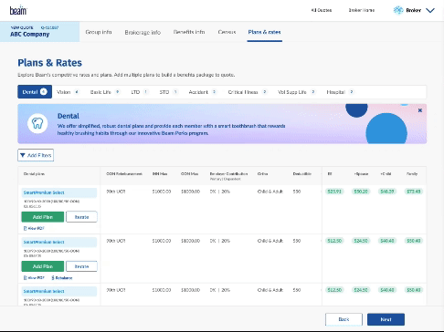
A very good point that came up in a design review is that the cards that feature the “rebalance” CTA shouldn’t be a catch all for bolt on functionality. This seemingly small change to the UI would eventually greatly change how I surfaced this feature, having it appear in the horizontal drawer where all the edit quote functionality lives. From here, the final design was taking form.

At this point, I made fairly granular changes: note the more subtle yet effective CTA to the right of the rates, the shimmer loader, the smaller confirmation notification. At this point, I had progressed the designs as far as they could go without user feedback.

Usability Testing
User tests were largely positive. Most of the feedback for the tier rebalancing feature were around the language.
The Positive
-
BQT is intuitive. Both Tier Rebalancing and BQT Design prototypes received average SUS scores within the “excellent” range. Tier Rebalancing within a self-quoting tool was new to all interviewees, but they were able to successfully complete the process.
What I Can Do Better
-
Include a definition of Tier Rebalancing: The UI for tier rebalancing was intuitive for interviewees, but the concept was not. Two interviewees erroneously believed that Tier Rebalancing decreased the overall cost of the plan:
Usability Take Aways
These are a couple take aways from testing that I implemented into the final design:
Rename
Tier rebalancing proved no to be intuitive to our users, so I looked into more intuitive names.
Design system
Design system for tool tips/info bubbles need to be developed (high level)
.png)
Prototype
Here is a recording of the prototype in action.
Learnings
Every project teaches you something. This one taught me two things I will carry into every engagement going forward.
The Feature That Explained Itself, Until It Didn't
One of the more humbling moments in usability testing came when it became clear that the language surrounding tier balancing was not as intuitive as I had assumed it was.
I will be honest about where that assumption came from. I had spent significant time immersed in this feature, its logic, its mechanics, and its value proposition. By the time we reached testing, the concept felt self-explanatory to me. The tool did what it said it did, and I believed the value demonstrated itself clearly enough that users would orient quickly and move forward with confidence.
That is not user-centered thinking. It is designer-centered thinking wearing user-centered clothing, and usability testing exposed the difference clearly.
Users who had not lived inside this project the way I had encountered the language fresh, without the contextual scaffolding I had unconsciously built up over months of working on the feature. What felt obvious to me was genuinely ambiguous to them. And ambiguity at the point of entry, before a user has even committed to engaging with a tool, is one of the most damaging friction points a product can have.
The learning here is not simply that usability testing is useful. It is that usability testing is especially valuable precisely in the moments when you are most confident you do not need it. Certainty is not a reason to skip research. It is a reason to be more rigorous about it.
Copy Is Not a Finishing Touch. It Is a Design Material.
The language confusion this project surfaced also pointed toward a deeper and more systemic issue that I think the design community as a whole has not fully reckoned with: the persistent undervaluing of copywriting in UX.
It is easy to understand how this happens. Visual design is immediate and visceral. A layout either works or it does not. A color palette either feels right or it does not. The feedback loop is fast and intuitive. Copy, by contrast, can feel like something you drop in once the design is settled, a layer of finishing detail that sits on top of the real work rather than being part of it.
This project was a clear reminder of how wrong that framing is.
The words we use to describe a feature, label an action, explain a concept, or set an expectation are not decoration. They are the primary interface between the product and the user's understanding of it. A beautifully designed screen with unclear copy is not a well-designed screen. It is a visually polished source of confusion. And confusion, regardless of how good it looks, erodes trust and increases drop-off.
Copy deserves an equal seat at the design table, not as an afterthought that gets reviewed at the end of a design cycle, but as a core design material that is considered, tested, and iterated on with the same rigor we apply to layout, hierarchy, and interaction. The best products are the ones where the visual and verbal design have been developed in genuine partnership, each one making the other stronger.
This project reinforced that conviction in a way I will not forget.
Conclusion
The Premium Balancing project was, on the surface, a relatively contained design problem. Take a manual, spreadsheet-based workflow that was consuming meaningful underwriting capacity, and replace it with a self-serve tool that any Market Development Executive could operate independently. The scope was clear, the business case was compelling, and the solution was architecturally straightforward.
But the most interesting things about this project were not the things that went according to plan.
The feature had been conceived, deprioritized, and revived over the course of a year. The platform it lived within had been substantially redesigned in the intervening time. The language that seemed self-evident from the inside turned out to be genuinely unclear to the people encountering it fresh. And a tool that appeared simple on the surface carried enough conceptual ambiguity that usability testing, which I had initially considered almost a formality, turned out to be one of the most consequential investments the project made.
Each of those unexpected moments contained a lesson worth naming.
The year-long gap between the original concept and the eventual build was not wasted time. It was a period in which the business context sharpened, the urgency became undeniable, and my own understanding of the problem deepened in ways that made the eventual design more considered than it would have been if the project had moved forward on the original timeline. Sometimes deprioritization is a gift in disguise.
The platform overhaul that invalidated the earlier designs was a reminder that design work does not exist in a vacuum. Products evolve, systems change, and the designs we produce are always in conversation with a broader context that we do not fully control. Flexibility and the willingness to start fresh when the situation calls for it are not weaknesses. They are essential professional skills.
The language confusion surfaced in testing was perhaps the most personally significant learning of the project. It challenged an assumption I had not even recognized I was making, that deep familiarity with a feature translates into clarity for the people encountering it for the first time. It does not, and the humility required to accept that is not a one-time lesson. It is something worth recommitting to at the start of every project.
And the broader copywriting insight this project crystallized, that words are a design material deserving of the same rigor and intentionality as visual design, is something I will carry into every engagement going forward. The best interface in the world cannot compensate for language that leaves users uncertain about what they are looking at or what they are being asked to do.
What this project ultimately delivered was meaningful on multiple dimensions. The underwriting team gained back capacity that had been quietly consumed by a manual process for far too long. Market Development Executives gained a tool that gave them real autonomy at a critical stage of the sales process. And Beam gained a structured data asset, in the form of systematically captured pricing intelligence, that had simply not existed before.
But the deliverable I am most proud of is not the tool itself. It is the design process that shaped it: research-driven, honest about its own assumptions, willing to be surprised by what testing revealed, and committed to getting the language right alongside the visuals.
That is the standard I try to hold myself to. This project helped me hold it a little more firmly.