


Ginger roots
Ginger's mental health services, tailored for teens, ages 11-18.
Team: Group Project
Role: UX Researcher, Designer
Timeframe: Three Weeks
Tools: User Research, Affinity Mapping, Journey Mapping, Wireframes, Prototyping, Usability Testing, User Flows, UI Design
Intro
Lacking life the experience to help them understand a flood of new and confusing emotions, teens are not unlike space explorers: in unfamiliar territory, navigating through it the best way they know how. And with a pandemic that forces teens away from the peer support networks that they’ve come to rely on, the need for mental health services for teens has never been more apparent than it is today.


So why not use the Ginger app? It’s made mental health accessible to adults the world over, and has everything an adult would want in a therapy app. Great idea, except that Ginger is for adults–not teens. Teens have different needs when it comes to mental health, and they tend to resist traditional forms of therapy. So — to continue with the space metaphor — Ginger is NASA. What we need is Space Camp.
The Process
And this is where my team and I come in. Astronauts in our own right, we’ve been tasked with boldly going where Ginger has yet to go by creating a version of Ginger for teens. The problem? None of us are teens. We don’t even know any teens. How do teens browse? How do they interact with each other? What do teens do differently from adults, and how can we accommodate them in our product? This would prove to be the crux of our research.
Research
Getting to Know the Product
Ginger is already doing a great job at providing adults easy access to comprehensive mental health services. Chief among these services are as follows:
-
Providing on-demand support to people globally, through smart phones.
-
Taking a preventative approach to mental health
-
Addressing issues before they evolve into greater challenges by identifying patterns of anxiety, stress, and depression.
This will provide a strong foundation of what services Ginger Roots will provide to teens.
C&C Analysis
This Competitive and Comparative analysis reflects the aforementioned foundations of accessibility and preventative care that promise to make Ginger Roots a strong teen-mental-health provider.
It also reveals opportunities to better serve our teen demographic: Our research indicates that teens tend to gravitate toward more community or peer based mental health solutions.

Defining Our Demographic
With these considerations in mind, we wanted to take a deep dive into how teens interact with technology, each other, and mental health.
Affinity mapping
If you’ve ever seen any stock imagery of people “doing UX”, it’s probably of designers using this process in which quotes are committed to post-it note, then grouped according to theme.

For our affinity mapping, we interviewed interviewed 5 teens, ages 11–18, as well as 2 mental health professionals who work with teens. Some particularly standout quotes from our affinity mapping is as follows:
”My friends know me better than anyone else in my life.”
Kids rely heavily on meaningful relationships with their peers to solve problems, get advice, and make sense of the world.
”I use technology to keep in touch with friends”.
Technology has never been more present in teens’ lives than it is today. It enables teens to maintain and enhance those meaningful relationships that are so important to them.
”Teens are so supportive of each other — sometimes too much”.
Teens are surprisingly empathic, focusing on their friends’ mental health while neglecting their own. Not wanting to burden others, they’ll keep their problems to themselves until it’s too late.
Persona
From our interviews and research, we created a fictionalized user called a persona — an embodiment of the research and interviews that we conducted — whom we named Jenny.
Jenny is a 15 year-old high-school freshman, who is highly social and cares about her friends.
She is a good student, and holds herself to high expectations. Jenny gets stressed out from the pressure within and without, and she doesn’t want to burden her friends with her problems. So she needs to find an outlet to handle her stress better, without bothering her friends.
With Jenny embodying our synthesized research, we’re ready to move onto our problem statement.

Problem Statement
Jenny needs a private way to address her own mental health issues outside of her normal social/family circle because being the model student, friend, and daughter is causing her stress and burn-out.
Solution Statement
Ginger Roots is a mobile app that provides teens with a private space to talk with peers about their issues, receive support from a mentor/counselor, access resources about mental health, and potentially connect with a licensed therapist.
Design
User Flow
Let’s talk about how our persona, Jenny, actually uses this app. In the user flow that we created for this app (see diagram below), Jenny opens the app to talk about her stressors in the discussion board, and then chats with her coach. After doing both of those action items she feels less stressed and more relaxed.

Sketches and Wireframes
With a user flow in place, we can blast-off to some renderings of our app–sketches and wireframes. We did some initial sketches as a generative activity, then found our way to the wireframes, which would bare a closer resemblance to our final product, and which we could test on users.


Usability Testing
After two rounds of extensive usability testing, we were able to pinpoint the key success factors of Ginger Roots, as well as the main things that we’d need to improve upon.
Pros
-
Navigation is easy and intuitive for the most part.
-
Users were excited to use services like breathing and meditation.
-
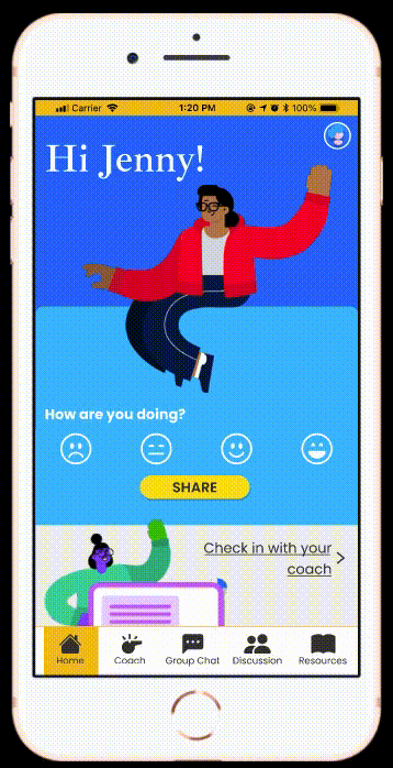
Mood tracker is appealing (particularly fond of the smiley-face barometer)


Con
-
Users did not understand what the forum was.
-
Some users got confused between group chat and coach.


UI Choices
Our research into teen browsing habits greatly informed how we structured our UI. Particularly enlightening was a 2019 study by the Nielsen Norman Group. Researchers found that “[a]lthough teens might feel confident online, they do make mistakes and often give up quickly. Fast-moving teens are also less cautious than adults and make snap judgments; these lead to fewer successfully completed tasks.Teens perform worse than adults for three reasons: Insufficient reading skills, Less sophisticated research strategies, Dramatically lower levels of patience”.
To that, we made our UI:
-
Eye catching to hold teens’ attention.
Teens tend to have a lower attention span, so visually stimulating elements are a must.
-
Easy to navigate.
This should be a no-brainer for designers, and it goes double when designing for younger users. Teens have not developed their research habits as much as adults have, so it’s imperative to make sure navigation is as intuitive as possible.
-
Simple Copy / Casual Tone.
Writing copy for a teen audience might be the most challenging aspect of the process. Teens don’t care for an authoritative voice commanding them to do anything, but just as deadly to the tone is pandering to teens. They’re like wolves when it comes to BS, so if you’re pandering to them, they’ll know. The solution? Address them as peers.
Prototype
Jenny’s User Flow
With several usability tests under our belt, we’re ready to move onto a high-fidelity prototype. Here’s the scene:
Jenny has been worried all-week about her trig test. Meanwhile she’s been trying to be there for a friend who’s going through breakup, and she’s helping her parents cook dinner and take care of her little brother while they work long hours. Now it’s the night before her test and she’s at a breaking point. She doesn’t want to bother her friends or parents, but she needs to find a way to cope with the stress right now.
•Path 1

•Path 2

•Path 3
Solution
Jenny has many avenues to solve her problem, as a teen would like to solve it :
-
She can crowdsource a solution from her community in the discussion board or in the group chat.
-
She can seek out specialized information in the resources section, as if she were browsing youtube.
-
She can escalate her issue to a mentor: this is someone who may be an adult, but is close enough to her age that their advice takes into account her teenage experience.
Next Steps
Our initial successes with Ginger Roots have encouraged us to continue refining our prototype in ways that will help our users.
-
Additional Features
Before launching, we believe that fleshing out the profile section with more features such as badges will greatly increase adoption and retention.
-
Desktop Site
Some of the teens said that they preferred browsing and using apps on their laptops rather than their phones. For those individuals, as well as those without phones, a desktop version of Ginger Roots could be a boon.
-
Ease of Use
As we gather more content for the activities and resources section, it may be necessary to categorize them beyond their type of exercise, so that users can more easily find the specific exercise that they’re looking for.
Learnings
What did I learn? What would I do differently?
•Accessibility
In my efforts to try to empathize with teens and think about their mental health, I believe I overlooked the accessibility needs of this product. In the future I will be more mindful of WCAG text color and size, heading mark-up, and alt tags.
•Responsive Design
Contrary to our assumptions, a significant amount of our users said that they use many apps on their desktop computers rather than their mobile device. Had I known this, I would have used auto-layout in Figma to design the entire prototype.
Conclusion
I believe the biggest strength of Ginger Roots is that it focuses on teens’ competencies rather than their shortcomings. Using teens’ natural inclination toward highly social behavior and aversion to traditional therapy, Ginger Roots brings teens together in supportive, virtual communities. Treating them as peers—yet acknowledging that their worldview is inherently different from our own—Ginger Roots has the foundations for an app that could truly help teens in a way that’s out of this world.
Epilogue: A Note About my Team
I’d be remiss if I did not mention the sheer joy I had working with Kris Huynh and Melanie Schultz. I cannot too highly express my admiration for and awe of these two individuals, and hope that we get to work together again.